
Switzerland played a key role in the history of graphic design after the Second World War. It was heavily influenced by the artistic theories and movements of the early 20th century, including US architect Louis Sullivan’s dictum “form follows function”.
Two styles in particular prevailed: Concrete Art, represented by the Zurich School, and New Objectivity, represented by the Basel School.
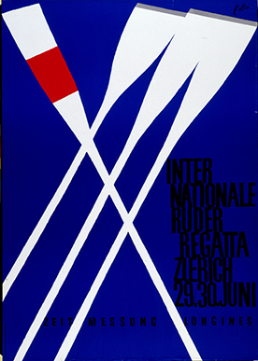
Concrete Art and the Zurich School
© Sonia Petignat-Keller
The Zurich School espoused the theories of Concrete Art, a movement started by Theo van Doesburg, co-founder of the magazine De Stijl. The Concrete Art posters produced in Zurich had the following distinguishing features:
- Lines, colours and spaces dominant
- Basic geometric shapes – square, circle, triangle, rectangle
- Clearly “readable” spaces and only the bare minimum of information
- Asymmetrical arrangements
Ernst Keller (1891–1968) was a leading exponent of this style. He started Switzerland’s first course in graphic design at the Zurich School of Design. Keller believed that a poster must be immediately and effortlessly understood if it is to be effective and that the choice of image, text, style, colours and composition had a vital role to play in achieving this.
He paved the way for a whole generation of artists, including Max Bill (1908–1994), who created the International Typographical Style – also known as the Swiss Style – after the Second World War.
Typography
A well-designed poster combines images and text in a harmonious and complementary way. Whereas posters had previously been designed purely as images without text, this became inconceivable under the influence of the Bauhaus, which elevated typography to the status of a central element of design in its own right.
The 1928 book “The New Typography” by designer Jan Tschichold (1902–1974) is still seen as a benchmark today. In it, Tschichold argues for
- the importance of typography,
- asymmetrical composition,
- the use of graphic bars,
- and simple, clear solutions.
Whereas the Zurich School put the emphasis on typography and tended towards abstraction, the Basel School developed a form of realism based on the style dubbed New Objectivity.
Last modification 07.12.2018


Contact
Swiss National Library
Prints and Drawings Department
Hallwylstrasse 15
3003
Bern
Switzerland
Phone
+41 58 462 89 71