
An innovative printing method makes colour come alive in the works of master screen printer Lorenz Boegli. Like on a display screen, red, green and blue are mixed to produce all the other colours. In this way, the well-known CMYK colour model (cyan, magenta and yellow) is inverted.
By Lisa Oberli
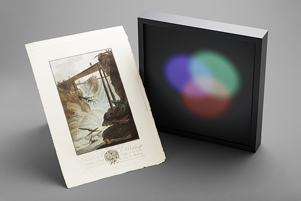
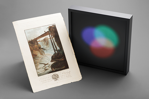
The showcase “Red, Green and Blue” by artist Marco Ganz (*1961) could have come from a Baroque cabinet of curiosities as it illustrates an impressive natural light phenomenon in an artistic artefact. The work therefore visualises – in a seemingly miraculous way – the basic principles of visual perception. The screen print contained in the showcase seeks to capture “printed light”, no less. The art edition was captured on paper in 2021 in the screen printing workshop of Lorenz Boegli (*1965) in Müntschemier in the canton of Bern.
Red, green and blue
On a jet black background, the light colours red, green and blue – similar to those we are familiar with on display screens – are additively mixed. Three ellipses in these primary colours that look like light cones are superimposed to produce the secondary colours cyan, magenta, and yellow, and in the centre a brilliant white. However, the pigments contained in the printing ink only reflect the incident light in red, green and blue, and all the other colours are created by the viewers’ sensory perception.
Why is this surprising? Because the three-colour theory of Thomas Young (1802) and Hermann von Helmholtz (1850) states that all perceptible colours can be made by combining light in the wavelengths for red, green and blue. The resulting RGB colour space is used for self-luminous systems such as monitors, in which colours are displayed through a combination of red, green and blue dots. On the basis of centuries-old understanding, however, this method of colour mixing is not used in printed images, where the laws of subtractive colour mixing generally apply (with the base colours cyan, magenta and yellow).
Iridescent colours
With his screen printing art, Lorenz Boegli pushes these boundaries. The particular visual effect of his prints is based on the iridescent colour effect of the mineral mica. It comes from the refraction of light on transparent mineral pigments which appear almost colourless on white paper. Boegli started experimenting with iridescent pigments in the late 1990s. In 2013, he developed the “additive four-colour RGB printing process” in collaboration with the company Merck. This innovative printing technique utilises the properties of screen printing: the screen fabric is capable of transferring a large number of the relatively coarse special pigments used onto the paper in a single printing process.
An invention in printing technology

© Lorenz Boegli
With the additive RGB four-colour printing process, Lorenz Boegli has come up with an innovation that inverts the well-known four-colour CMYK printing method in cyan, magenta, yellow and black (key). Both forms of multi-colour printing require a decomposition of the print design into individual colour separations. This can be seen in the screen print “Iris”, produced in 2024. The colour control strips on the right-hand edge of this print show that it was printed in red, green, blue and white. A close-up view of the same print reveals the fine dots in red, green, blue and white produced by the screen structure. The motif of the iris again points to human colour perception, which is based on the sensory cells for red, green and blue.
Blue, red and yellow: historical four colour printing

© Lorenz Boegli
Lorenz Boegli’s “alchemistic” printing of light and its contrast, namely printing with pigments, can be traced back to a historical debate. The natural philosopher Isaac Newton (1642–1727) proved the additive nature of natural light in 1671 (that it is made up of different coloured rays), but he did not at first draw a distinction between light colours and pigments. In his work “Opticks”, published in 1704, he set out the hypothesis that colour pigments could be mixed to make the spectral colours violet, indigo, blue, green, yellow, orange, red and white.
Newton’s attempt to apply the mixing of light colours to those of pigment colours provoked lively discussion among artists as they had long been aware that all material colours could be obtained by mixing just three primary colours, namely blue, red and yellow (the modern-day cyan, magenta and yellow). In 1710, shortly after Newton’s groundbreaking publication, the printer Jacob Christoph Le Blon (1667–1741) invented three-colour printing and later four-colour printing, which was based on precisely these three colours, plus black.

The colour print “Chute de la Tritt dans la Vallée de Muhlethal” is an example of this technique. In the foreground we can see a rainbow, the perfect example of refracted light. This print thus also attempts to capture printed light, only the opposite way round from Lorenz Boegli. Because surprisingly, the rainbow doesn’t have seven colours, but three: blue, red and yellow – the base colours of printed images (up to now!)
Bibliography and sources
- Ulrike Boskamp: Primärfarben und Farbharmonie: Zur Farbe in der französischen Naturwissenschaft, Kunstliteratur und Malerei des 18. Jahrhunderts, Weimar: VDG-Verlag, 2009.
- Susanna Koeberle: Gedrucktes Licht, in: Hochparterre 10 / 23.
- Willi Raeber: Caspar Wolf, 1735–1783. Sein Leben und sein Werk. Ein Beitrag zur Geschichte der Schweizer Malerei des 18. Jahrhunderts, Zürich: SIK-ISEA / Aarau: Verlag Sauerländer / München: Prestel Verlag, 1979.
Last modification 30.12.2024


Contact
Swiss National Library
Prints and Drawings Department
Hallwylstrasse 15
3003
Bern
Switzerland
Phone
+41 58 462 89 71