
While working as a graphic designer, ad designer and visual artist, the Basel-born Karl Gerstner (1930–2017) developed two comprehensive font families that are still available in online font libraries today. But who owns the rights to Gerstner’s typefaces?
By Isabelle Kirgus
In 1993, the Berlin-based company H. Berthold AG filed for bankruptcy. This marked the end of the storied history of the firm, which in the 1920s had reigned as the largest typesetter in the world. Many iconic font designers worked for Berthold: Bauhaus artists such as Herbert Bayer, for instance, as well as Günter G. Lange (1921–2008), an influential redesigner of old typefaces who also served as the company’s artistic director. While other Swiss graphic and type designers worked with the Haas Type Foundry in Münchenstein near Basel – the birthplace of the Helvetica font – Basel-native Karl Gerstner entered into a contract with Berthold, which was world famous in typographic circles. His fonts Gerstner Programm and Gerstner Original were both offered by Berthold.
A font for IBM
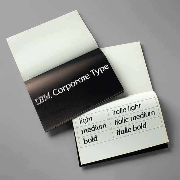
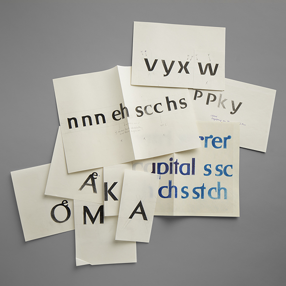
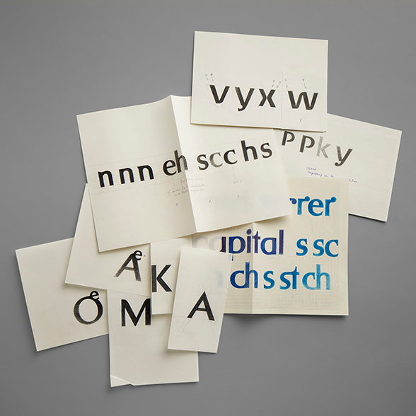
In the early 1980s, Gerstner was commissioned to make a corporate font for IBM. The company wanted a serif font: an easy-to-read script with small strokes at the ends of each letter. However, Gerstner developed a completely new bespoke sans-serif font that he called IBM Original. He presented the script to the executive management of IBM, but without success: the font was ultimately rejected. Fortunately, Gerstner was able to secure a patent for his designs. In 1987, he marketed the rejected IBM font under the name Gerstner Original via Berthold in Berlin.
“Ahead of its time”
Gerstner had dealt with typography in depth during his career – an obvious subject for a graphic designer and ad man who created harmonious image and text concepts for his clients. “Writing [is] the medium of communication, and typography [is] the packaging,” he wrote. “The writing must be legible, but the typography must invite you to read.” He achieved precisely that with the ingenious Gerstner Original – a very modern and highly aesthetic font that was hailed as being “ahead of its time” by Gerstner’s contemporaries. Gerstner Original clearly took inspiration from the sans-serif “grotesque” font style while also representing something new, as demonstrated by the fluid spaces inside the letters, particularly in the capital B and P and the number 8, and by the strikingly aesthetic implementation of umlauts. Surprisingly, however, the font did not enjoy much popularity. It was mainly Gerstner himself who used the font for his own publications and correspondence. He also expanded the script into a more extensive font family.
“Ahead of its time”

Gerstner Original was licenced by Berthold until 1993. Afterwards, the legal situation becomes unclear. Their font library became homeless following the liquidation of H. Berthold AG by the Berlin Charlottenburg district court. Berthold fonts appeared on eBay and various online font platforms. Gerstner Original was also sold by the Berlin-based company Babylon Schrift Kontor under the name “kg original”, for instance. Later the Chicago-based company Berthold Types Ltd. claimed to have bought the rights to all Berthold typefaces in 1997. Karl Gerstner saw things differently: shortly after H. Berthold AG declared bankruptcy, he submitted a written statement to the Berlin district court reclaiming the copyright on both of his fonts. On 25 August 2022, the Massachusetts-based Monotype Imaging Holdings Inc., described as “one of the world’s largest type foundries”, announced that it had acquired the inventory of Berthold Types Ltd. The company now offers Gerstner Original under the name Gerstner® Original BQ.
What the future holds
Gerstner’s typographical designs are part of Switzerland’s “intangible cultural heritage”. In 2014, “Swiss graphic design and typography” was proposed as one of eight living traditions for the country’s UNESCO Intangible Cultural Heritage List. Should the proposal be approved, it would certainly be a posthumous confirmation of Karl Gerstner’s legacy.
Karl Gerstner, born and died in Basel (1930–2017). Completed a graphic design apprenticeship under Fritz Bühler and attended courses at the Gewerbeschule Basel under Emil Ruder. Together with Markus Kutter, he founded the advertising agency Gerstner + Kutter in 1959. Following Paul Gredinger’s inclusion in 1962, the agency was renamed GGK and went on to be very successful. Gerstner was an instrumental figure in graphic design over several decades and created many corporate designs that continue to influence visual communication to this day (Capital, Langenscheidt, Swissair, etc.). His archives – advertising campaigns, typeface designs, colour schemes, correspondence, etc. – are now housed in the Swiss National Library’s Prints and Drawings Department along with the archives of the GGK ad agency.
Bibliography and sources
- Katerina Vatsella: “Karl Gerstner”, in: SIKART Lexicon on art in Switzerland, 2012 (consulted on 2.11.2022).
- Karl Gerstner: Compendium for literates: A system of writing (transl. by Dennis Q. Stephenson). Cambridge/Massachusetts; London: Massachusetts Institute of Technology, 1974.
- Karl Gerstner: Designing programmes. Four essays and an introduction. Teufen: Niggli, 1964
Last modification 19.01.2023


Contact
Swiss National Library
Prints and Drawings Department
Hallwylstrasse 15
3003
Bern
Switzerland
Phone
+41 58 462 89 71