
The golden age of Swiss graphic design came after the Second World War. The newly emerging International Style was also referred to as the International Typographic Style or the Swiss Style. It placed the emphasis on typographic elements and used lines and curves based on mathematical equations to create an ordered and unified structure.
© Armin / Matthias Hofmann
The new style built on the theories of the Zurich School and intermixed them with those of the Basel School. It had the following distinguishing features:
- Precision in detail and execution
- Use of a typographic grid and sans serif typefaces
- Simple typography
- High visual impact
- Rational composition with zero ornamentation
- Use of photography (mostly in black and white) instead of illustration
The general impression is of a highly structured, harmonious and easily readable composition dominated by lines and restrained use of colour.
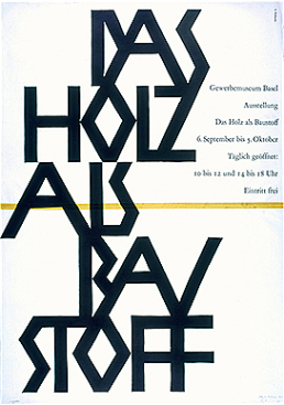
Armin Hofmann (b. 1920), head of the School of Arts and Crafts in Basel and founder of the Basel School, played a substantial role in popularising the International Style, forging links with Yale Art School in the US. Hofmann’s much-copied style employs photomontage, precise typography and rigorously geometric composition, often in black and white.
It was not until the 1970s and 1980s that the International Style was gradually superseded by new approaches.
Last modification 07.12.2018


Contact
Swiss National Library
Prints and Drawings Department
Hallwylstrasse 15
3003
Bern
Switzerland
Phone
+41 58 462 89 71